7 QC Tools

Why Live!QC Tools Are Essential
Every process has inputs and outputs. To achieve the desired output, inputs and process parameters must be controlled and improved. If inputs and processes remain unchanged, output quality cannot improve.
Live!QC Tools, powered by the 7 QC Tools, enable continuous monitoring, analysis, and control of process variables. By identifying cause-and-effect relationships and tracking data in real time, organizations can optimize performance, reduce variation, and maintain consistent quality.
The 7 QC Tools help teams make data-driven decisions, detect issues early, and ensure process stability across operations.
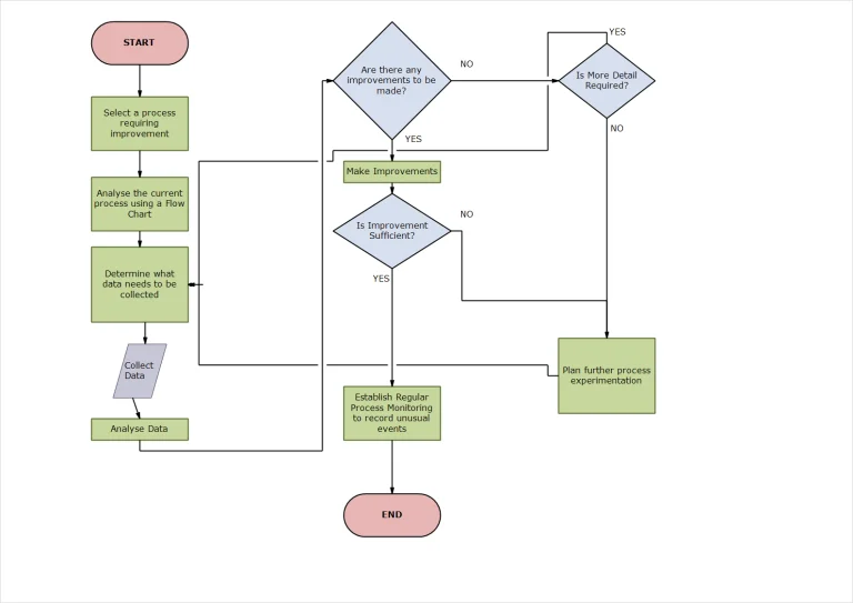
FLOW CHART
To improve any process, it is essential to clearly define activities, conditions, and milestones. This is achieved by creating a process flow chart that maps supplier and customer relationships (internal and external), standardizes procedures, and highlights process complexity and improvement opportunities.
Whether designing a new process or optimizing an existing one, a detailed flow chart provides clarity and transparency. Making the flow chart visible to stakeholders and incorporating feedback from process participants helps improve productivity and eliminates issues caused by assumptions. Flow charts shift organizations from person-centric decision making to process-centric execution.
PARETO CHART
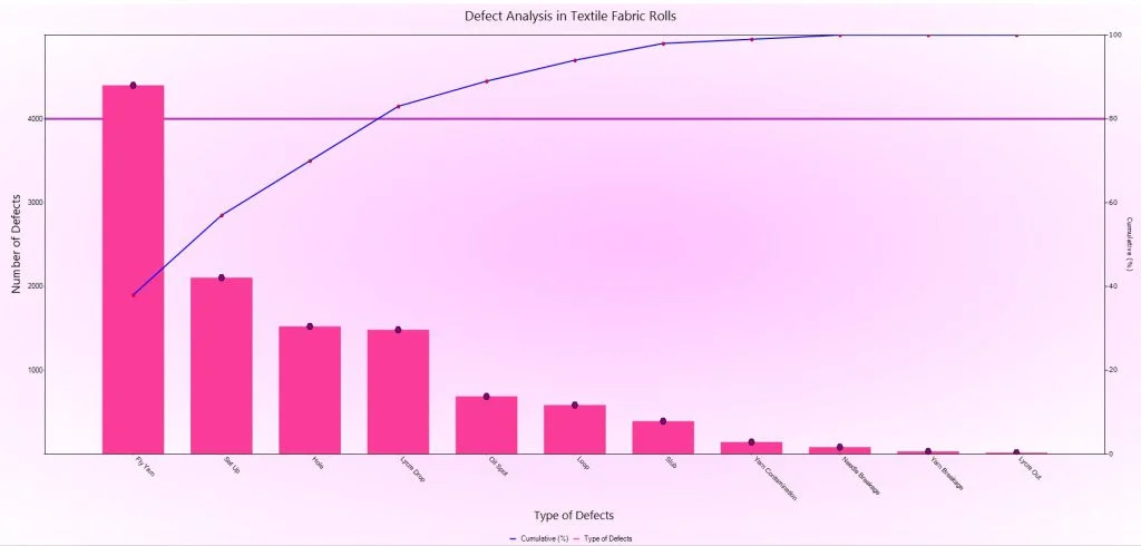
A Pareto Chart helps identify the vital 20% of causes responsible for 80% of process issues or effects. By ranking causes based on their impact, Pareto analysis highlights the most significant contributors while showing the minimal influence of lower-priority factors.
Using a Pareto Chart allows organizations to focus improvement efforts where they deliver the maximum impact. Although the 80/20 principle is empirical, it consistently produces effective results when applied with process knowledge and historical data.
Advantages of Using Pareto Charts
- Quantifies the impact of key influencing factors
- Prioritizes critical causes affecting the desired outcome
- Reduces analysis time by focusing on fewer variables
- Accelerates issue identification and elimination
- Supports data-driven decision making
Pareto Charts are one of the 7 QC Tools widely used for process improvement, defect reduction, and quality control.
HISTOGRAM
A Histogram converts numerical data into a clear graphical format, making it easier to understand and analyze process performance. Raw data, when not visualized, often remains unused and provides little value to the organization. Histograms follow the principle that a visual representation reveals patterns faster than numbers alone.
By grouping data into defined ranges (bins), a histogram displays the frequency distribution across the data set. This visualization highlights how values are distributed around a central point and shows where results occur most frequently.
Histograms help assess process capability, variation, and data spread. The presence of multiple peaks (multi-modal distributions) often indicates process instability or underlying issues, signaling the need for corrective actions. As one of the 7 QC Tools, histograms are essential for data-driven quality improvement and process control.
SCATTER DIAGRAM
A Scatter Diagram is used to determine whether a relationship or correlation exists between two variables. By plotting paired data points on a graph, the pattern of distribution reveals whether the variables are related and whether the relationship follows a linear or curved trend.
Scatter diagrams help establish dependence or inter-relationship between parameters, making them useful for analyzing how one variable influences another. They can also be applied to evaluate inter-dependence between two processes, identifying whether changes in one process affect the outcome of another.
When used alongside cause-and-effect analysis, scatter diagrams enable quicker identification of potential root causes, helping organizations mitigate risks, improve process stability, and enhance quality outcomes. As part of the 7 QC Tools, scatter diagrams support data-driven decision making and continuous improvement.
FISHBONE DIAGRAM
The Fishbone Diagram, also known as the Cause and Effect Diagram or Ishikawa Diagram, is a structured technique used to identify and analyze the possible causes contributing to a specific problem or effect. It leverages the collective expertise of cross-functional teams, drawing insights from within and outside the organization.
In a fishbone diagram, the effect or problem is placed at the head of the diagram, while potential causes are represented along the branching “bones.” These causes are systematically categorized to ensure comprehensive analysis, commonly using classifications such as Man, Machine, Method, Material, and Environment.
This visual tool promotes knowledge sharing, root cause identification, and structured problem-solving. By capturing both significant and minor causes, the fishbone diagram forms the foundation of quality control and continuous improvement activities. As one of the 7 QC Tools, it plays a critical role in identifying root causes and improving process performance.
CONTROL CHART
A Control Chart is a key statistical quality control tool used to monitor and control processes that generate variable data by tracking accuracy (central tendency) and precision (data spread). It relies on evidence from randomly collected process samples to evaluate whether a process is operating within acceptable limits. Control charts help determine when a process should run without adjustment under common cause variation, provide early warnings of potential deviations, and signal the need for corrective action when assignable or special causes of variation occur. This makes control charts essential for maintaining process stability and preventing defective output.
CHECK SHEET
A Check Sheet is a simple yet powerful quality control tool used to collect data in a reliable, timely, traceable, and actionable manner. It enables consistent data gathering in a reusable format at the point of data generation, helping organizations capture accurate information from various sources such as person, machine, process, and sampling method. Check sheets ensure that all data—whether within or outside specified limits—is recorded, providing a complete and unbiased view for analysis. They serve as a primary data source for stakeholders to evaluate performance and initiate corrective or remedial actions when required.